We just completed one of our latest projects with Salesforce.com that involved the Developer Force team in creating and implementing a site for their Platform Mobile Services to showcase the variety of options for customers to build on mobile platforms. And since the site’s content is mobile-related, it only makes sense that the site renders well on mobile devices, right?
For those who are unfamiliar with the term “responsive design”, it can be easily described as a web design technique that is used in order to provide the best viewing experience possible with easy readability and navigation, and as little resizing and scrolling necessary across a variety of devices from desktop computers to mobile phones.
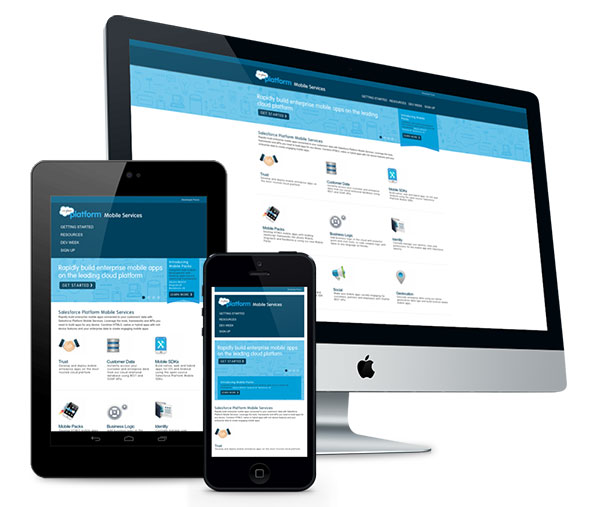
To get started, Salesforce.com’s design team provided LaunchDM with a design for standard desktop rendering which we then extrapolated as a design across a variety of devices and sizes. The optimizations made varied from little things like changing the spacing and font sizes to more complex items like rendering a horizontal set of buttons vertically on narrow screens. The result is a beautiful site where the same content (html) is used but the presentation (css) is different across different sized devices.
See for yourself by visiting events.developerforce.com/mobile… If you’re on a desktop browser, try resizing it and see how the page changes.