It makes me smile when I hear someone refer to a graphic designer as a “computer nerd”. Simply because I know for a fact that stereotype is actually kind of true, for the most part at least. However, I also know for a fact that if you look far enough past that Photoshop magician counting pixels on their Mac, you will most likely find someone that has artistic roots far deeper than just the Adobe suite.
For this post, I will revisit a project that I completed while I was working towards getting my BFA at the Pennsylvania College of Art & Design (PCA&D). In the fall semester of my senior year at PCA&D, I decided to take a silk screen printing class as an elective. Though not entirely necessary, the class peeked my interest because screen printing is, well, quite literally engrained into who I am today. My father owned and operated a silk screen printing business for over 20 years and I am proud to say that I was around to witness all of them! So the idea of making films and burning screens was practically second nature to me. The print shop was my second home in a lot of ways.
The project that always stands out to me from this class was The Propaganda Poster. Yeah I know, the idea of “Propaganda” in the world we live in is controversial at best, but this is, after all, art school. For me personally, the idea of a “Propaganda Poster” immediately conjures up visuals of old World War II “Keep your head down and make more bombs!” kind of factory wall art. So for my interpretation of the project, I wanted to go in a similar direction, but a bit less political.
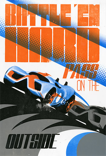
I have always liked cars and racing from a very young age, so naturally my mind went straight to some kind of racing propaganda to put a lighter spin on the idea. I quickly decided on a simple message for the poster; “Battle ‘em Hard, Pass on the Outside”. Oddly enough, I don’t think I ever even sketched out the idea. I knew what I wanted the poster to look like, so I got right to it. I took some measurements to figure out about where I wanted everything, then started drawing and laying out the typography. I should also mention, for this class as a sort of personal challenge, I decided I was going to hand draw all of the films for any typography I did. This project was no exception.
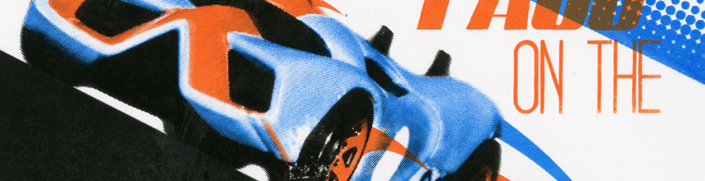
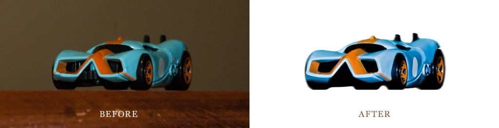
After I had the typography laid out for the most part, I started planning a very small scale photoshoot of sorts for the cars. Since I didn’t exactly own a race car (unless you call a 1995 VW Jetta a race car), I was going to have to improvise. What little kid that loves cars doesn’t have a few hundred HotWheels laying around (By “little kid” I mean a college student and yes, I do have a few hundred)? The photo needed some touch up and I needed to break it down to 4 colors for print (Cyan, Orange, Gray and Black). After adding some other graphics for an element of speed, I was off to print my films.
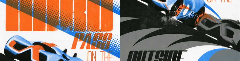
Films arranged and taped together, I burned all of my screens for each color layer and it was time for print! First the Cyan, then Gray, then Orange was topped off by the Black layer. Layering colors in the right order is critical in silk screen printing. One of the many things I love about hand screen printing something, especially with screens that have been used by countless other art students, is the uniqueness of each color layer. Only old beat up screens with hand drawn films can ad such a beautifully character-filled element of real, intentionally imperfect texture. You can see the finished product below.
Why go through this tedious old fashioned process when you could get similar effects in Photoshop you might ask? While part of it is simply the beautiful, natural textures and imperfections I mentioned earlier, for me, it is mostly the process. The act of creating something with my hands that takes more than a few key strokes and mouse clicks. It’s the sound of a rubber squeegee being pulled across a screen, the smell of emulsion, the residual ink left under fingernails for days after a good printing session. It’s the planning and preparation, waiting for emulsion to dry on the screens, the physical act of printing a piece of art, layer by layer, color by color.
I think this same kind of mentality and love of The Process is shared by a lot of modern day designers, the “computer nerds”. Because the need to memorize all of those Photoshop keyboard shortcuts almost always stems from the same place: a need to create. Not just silk screen printing, but in a very general sense. For some, it might be a background in carpentry, or painting, or metal working, or programming. It is simply the act of creation and the gratification of stepping back and saying “I made that. That is a small part of who I am, visualized.” That gratification is only magnified by the process it takes to get there, whatever it may be.