Color schemes are important to any design. In an effort to capture the color scheme for any particular season or time of the year we’ll be using the Adobe Color application for iOS paired with Adobe Creative Cloud. We will be taking photographs that we feel capture the essence of this time of year.
The application allows you to capture, create, and match color schemes found in the photograph, creating great color schemes for just about any use: painting a room, designing a website or designing graphics for a specific time of year, or maybe generating ideas for arts and crafts. For each color scheme, we will explain a little background on the photograph and how we captured the color scheme and then we will give the details on the colors (web hex values and CMYK breakdowns) for our readers to use for their own projects.
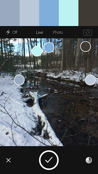 For this color scheme, I ventured into the woods behind my parent’s house in the mountains outside of Gettysburg, PA. My father does a lot of hunting back there, so I’m very familiar with the beautiful, wintery scenes that come with a decent snowfall. I headed back to his tree stand where I knew I could get a good photograph of the winding creek, bright blue sky, and farmland in the background. I wanted to get a good frosty, cold feel for this color scheme and I knew I could get it here. After setting up my Adobe Color app, I began snapping photos and capturing some color schemes. After a few shots, I came across this color scheme and the app created what I felt to be the perfect chilly color scheme. Light blue-grays, paired with bright blue and dark brown-grays felt quiet, cold and beautiful.
The first color, a medium blue-gray was captured from a few snow-covered rocks along the creek bank. The next lighter blue-gray was captured from the opposite side of the creek. The brighter blues were taken from the sky over the farmland in the background poking through the trees. And the final dark brown-gray was taken from the bark on the oak and pine trees on the other side of the creek. The combination of colors is perfect for arts & crafts or decorating for a winter-themed party. The neutral colors allow for relaxation of the eye, while the dark gray and bright blues could be used for pops of color to draw interest.
We hope you enjoyed our first Adobe Color scheme installment and we’re looking forward to sharing more of these color schemes with you as time goes on! Go ahead and let out your creative side and share a photo with us on Facebook or Twitter and show us how you’ve used our color schemes in your projects! We are always excited to see what others can come up with!
You can see the screenshot of the app in this post and I recommend downloading the Adobe Color app to try yourself!
Adobe Color is available on the iOS App Store
COLOR MIXES:
- Medium Blue-Gray: Web: #99aabf / Print: C41, M26, Y15, K0
- Lighter Blue-Gray: Web: #bac8d9 / Print: C26, M15, Y7, K0
- Darker Bright Blue: Web: #7eaed9 / Print: C49, M21, Y2, K0
- Lighter Bright Blue: Web: #bbf2f2 / Print: C24, M0, Y8, K0
- Dark Brown-Gray: Web: #403a34 / Print: C62, M61, Y66, K54