LaunchDM Creates: Welcome to our all new Fresh Paint series entitled “LaunchDM Creates” that will focus on the creativity of each team member’s creative abilities that go outside of what happens during regular business hours. We believe you can be creative in every aspect of the things you do, and our plan is to showcase that you don’t need to be in the creative department to show the right side of your brain.
Leah Rose Photography Book
Nick Belcher, Creative at LaunchDM
In my first semester of Senior Design Studio in college, our last project of the semester was to team up with a senior photographer and collaboratively create a photography book for them. The designers chose random numbers which designated the order to pick photographers. I was really hoping to work with Leah Kolakowski, as I am a huge fan of her work and already had some great ideas running through my head. Luck was on my side that day, as I was high in the picking-order and got to choose Leah’s photography to work with.
Leah has a very Victorian/Mucha inspired style of portrait photography. In my book design, I really wanted to capture this by using airy page designs with a single pop color to accent the black and white photography. Leah uses her middle name, Rose, as the signature for her photography. I knew immediately that I wanted to use a bright, rose-pink as the pop of color for the book against the black and white photography. This gave it a bright, inviting feel when combined with the darker emotion involved in the photography. The series of photographs she wanted to use with the book dawned the name, “Heroines.” They consisted of Victorian style portraits of women in nature (also known as environmental portraiture).
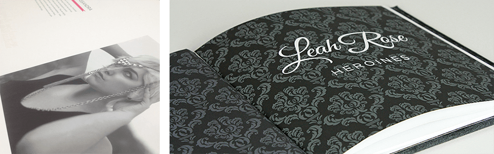
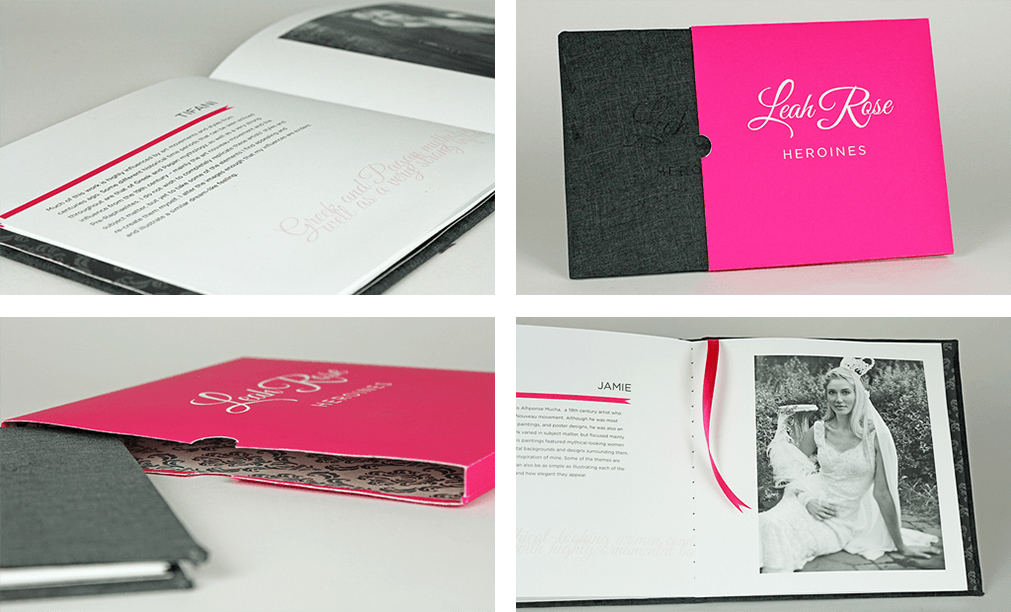
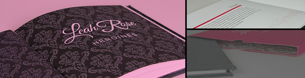
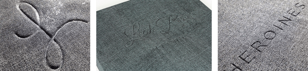
A lot of my first ideas for the design of the book actually came to fruition through the process because Leah wanted to give me free-reign on how it was going to look. After my first brainstorm session with her she loved all the ideas, so I started designing! I knew I wanted the book to be in a square format with a ribbon bookmark and have a slip-case. One thing we wanted to do was leave the photography on the pages by themselves so there would be nothing to distract the viewer from the image. The titles of the pieces were the models in the photos. I decided to put the model (and piece) name on the left side in the header and then break up Leah’s artist statement across the length of the book. This way as the viewer is reading through the book, it is all one long statement and the photography and names could stand more on their own. I used a dark victorian pattern for the inside covers and title page to set them apart from the content of the book as well.
The most exciting part of the book process for me was going to be the cover. I wanted to do a dark gray fabric debossed hard cover using the “logo” and title I created for the book. A “deboss” is when a design is “stamped” into a surface so that it is indented. Many higher-end books, business cards, and official papers use this effect to create a very clean look that still pops out to the viewer. The opposite of debossing is embossing, which is when a design raises up from the surface (typically stamped from the back side) to create a slightly protruded design. To do this, I contacted an old school friend of mine who hand-made a fabric cover once for some inspiration and to get the process off the ground. He gave me a lot of good pointers and my next step was to take my design to a graphics shop that could machine or laser cut the design out of a piece of plastic. I was going to be hand-making 3 of these books and needed to have 3 covers made. I worked with a local print shop to get the job done and after some trials with different materials and techniques, they finally found something that would work perfectly.
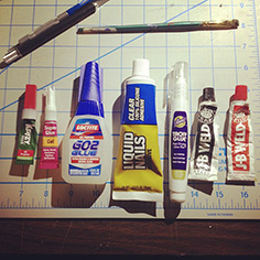
My next step was to head to the fabric store to pick out my fabric for the cover and ribbon for the integrated bookmark. I chose a bright, rose pink ribbon for the bookmark and a charcoal gray linen for the cover. As I was designing the interior of the book on my Mac, I was simultaneously working on getting the exterior of the book built. I had never built a book before so getting the debossing just right and figuring out how I was going to bind the book were both very challenging details for me. I tried about a dozen different adhesives and techniques to try and attach the fabric to the cover and create the deboss effect. I needed something that set quickly, but still gave me enough working time to create the deboss and not leave any residue. As it turns out, the one adhesive that I always had on me for college, spray adhesive, sprayed into a cup and brushed on and worked in small sections at a time, was the best solution. So the $75 I spent on other adhesives was pretty much for nothing…
 For binding the pages and book together, I reached out to a college friend who was really into book-making and knew a lot of different techniques. We decided that my best bet for binding the book would be to saddle-stitch all of the pages together, including the inside covers that would be glued into the hardcover. By doing this, it allowed me to hide the exterior stitching and keep all of the pages secure within the book. I opted for a dark gray thread to bind the book because when the viewer reaches the very middle of the book, I wanted them to be able to see the stitching to get the feeling that the book truly was hand-made.
Since the book was going to have a dark gray cover and a very white and airy feel on the interior, I wanted the slipcase to really pop. I opted to make the entire slipcase the same rose pink I used for other elements throughout the book and give the interior of the slipcase a reversed version of the victorian pattern that I used on the inside covers of the book. I used two dark grays on the inside cover of the book, so I used white and a light gray for the inside of the slipcase.
After assembling three entire books with slipcases, I presented the project to the senior design and photography classes and received great feedback. I was very happy with the outcome and this project lead to a few more book projects afterwards. I learned a lot about design, assembly and working in three dimensions and I had a ton of fun working on it.